Page 5 of 11
Pertinent Penguins Jerseys Posts
Posted: Tue Oct 09, 2018 10:58 am
by willeyeam
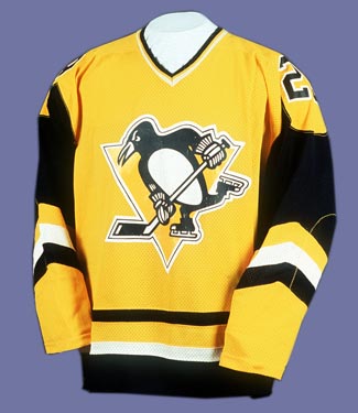
For the third jersey, it would not surprise me at all if it's an updated version of the old Sunday gold jerseys.
Stadium Series is anyone's guess.
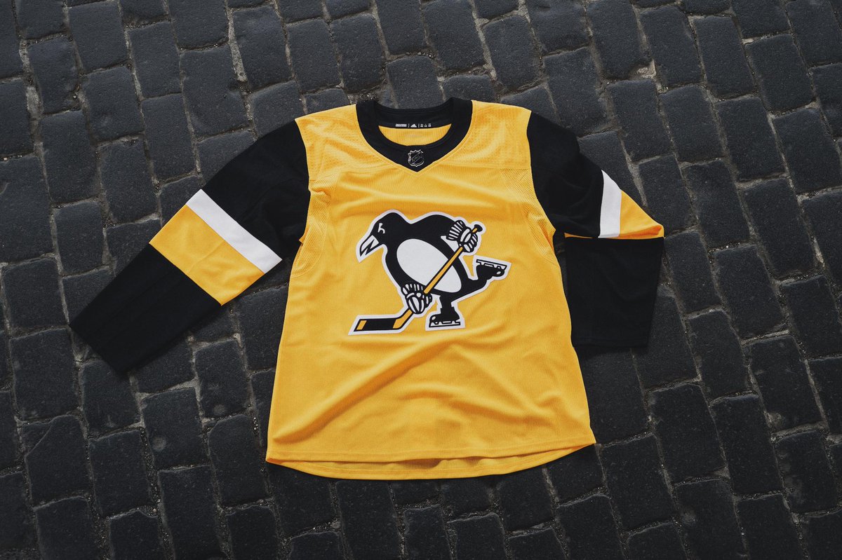
Meh. Super disappointing.
Pertinent Penguins Jerseys Posts
Posted: Tue Oct 09, 2018 10:59 am
by Gaucho
vom
Pertinent Penguins Jerseys Posts
Posted: Tue Oct 09, 2018 11:00 am
by FLPensFan
Pertinent Penguins Jerseys Posts
Posted: Tue Oct 09, 2018 11:00 am
by NTP66
I **** hate them.
Pertinent Penguins Jerseys Posts
Posted: Tue Oct 09, 2018 11:01 am
by Lemon Berry Lobster
A buddy sent me an image of it blank, looks better than with the numbers populated.
Pertinent Penguins Jerseys Posts
Posted: Tue Oct 09, 2018 11:01 am
by willeyeam
i mean, everyone was pretty much expecting the yellows right? they aren't great but it's no huge surprise either.
Pertinent Penguins Jerseys Posts
Posted: Tue Oct 09, 2018 11:02 am
by slappybrown
Were those originally only worn on Sundays in the 80s as nocera alluded to?
Pertinent Penguins Jerseys Posts
Posted: Tue Oct 09, 2018 11:02 am
by NTP66
Honestly, I was not, given that we already have the stadium series jerseys. Why make something that looks so similar?
Pertinent Penguins Jerseys Posts
Posted: Tue Oct 09, 2018 11:02 am
by Lemon Berry Lobster
I **** hate them.
Tell us how you really feel.
Pertinent Penguins Jerseys Posts
Posted: Tue Oct 09, 2018 11:02 am
by nocera
Again, throw the actual logo on it and it immediately becomes better. Move the numbers to the sleeve and it's great. This just comes off as lazy.
Pertinent Penguins Jerseys Posts
Posted: Tue Oct 09, 2018 11:05 am
by nocera
I was expecting this but obviously in the Adidas template with the Pens logo (including the damn triangle because that's the Pens logo).

How **** easy is that?
Pertinent Penguins Jerseys Posts
Posted: Tue Oct 09, 2018 11:05 am
by NTP66
Again, throw the actual logo on it and it immediately becomes better. Move the numbers to the sleeve and it's great. This just comes off as lazy.
I agree, those changes would make it look better. The mesh up top is so **** hideous, though. I guess I was just hoping for a different style of throwback.
Pertinent Penguins Jerseys Posts
Posted: Tue Oct 09, 2018 11:08 am
by dodint
Yeah, that mesh makes it look really cheap. Other than that I don't mind it, I think. Will like to see it in person.
I think my jersey buying days are over anyway so it wasn't like I was rushing out to get one regardless of what it looked like.
Pertinent Penguins Jerseys Posts
Posted: Tue Oct 09, 2018 11:09 am
by NTP66
Maybe it'll look better on a bigger person. For some reason, it looks like Letang is wearing a kid's jersey. Who knows.
Pertinent Penguins Jerseys Posts
Posted: Tue Oct 09, 2018 11:11 am
by nocera
I think my jersey buying days are over anyway so it wasn't like I was rushing out to get one regardless of what it looked like.
Yup. The good news is the Pens just saved me $200.
#NotMyLogo
Pertinent Penguins Jerseys Posts
Posted: Tue Oct 09, 2018 11:32 am
by meow
I dig them
Pertinent Penguins Jerseys Posts
Posted: Tue Oct 09, 2018 11:33 am
by Silentom
Uggo.
Pertinent Penguins Jerseys Posts
Posted: Tue Oct 09, 2018 11:36 am
by nocera
Here's the blank:
The
yellow gold needs to come down off the shoulder a bit. It looks like a vest.
Pertinent Penguins Jerseys Posts
Posted: Tue Oct 09, 2018 11:39 am
by NTP66
And now that you mention it, all I see is the vest.
Pertinent Penguins Jerseys Posts
Posted: Tue Oct 09, 2018 1:32 pm
by blurryhaze312
Here's the blank:
The
yellow gold needs to come down off the shoulder a bit. It looks like a vest.
Exactly what I said elsewhere. Even before seeing your photo I thought the yellow should come down further towards the elbow like the older jerseys. There's
way too much black on the sleeves. I also don't like the single layer/color "C" & "A". Small details are lacking, but they kind of added up.
Also agree on using the actual logo. Not a fan of this crest for an alternate.
Pertinent Penguins Jerseys Posts
Posted: Tue Oct 09, 2018 1:48 pm
by iamjs
I don't like it. Not at all. On a scale from A to an F, it's a C-. No bottom stripe, no triangle, and those sleeves make it look like a vest. I'm assuming the issue with the shoulder/sleeves is a result of the adidas template.
I'm with nocera on this one. They just saved me at least $200. I haven't bought a new jersey in a few years and I was looking to upgrade. I'm sure I eventually will, but it won't be to this one.
Pertinent Penguins Jerseys Posts
Posted: Tue Oct 09, 2018 2:25 pm
by Orlando Penguin
I hate the all yellow look. I like to crack on Nashville for their Tweety Bird look when they have the all yellow motif going. Why even bother with a 3rd jersey? Oh wait, that's right, cash money. Silly me.
Pertinent Penguins Jerseys Posts
Posted: Tue Oct 09, 2018 2:29 pm
by blurryhaze312
Again, throw the actual logo on it and it immediately becomes better. Move the numbers to the sleeve and it's great. This just comes off as lazy.
I agree, those changes would make it look better. The mesh up top is so **** hideous, though. I guess I was just hoping for a different style of throwback.
Oh I actually love that dimple effect on the shoulders. If it makes a difference, it's on all the jerseys in that same spot, including our home/away. I think they are just very prominent looking in that photo due to lighting.
Pertinent Penguins Jerseys Posts
Posted: Tue Oct 09, 2018 2:31 pm
by dodint
To be fair I think all of the Adidas jerseys look cheap, like a high school football jersey.
Pertinent Penguins Jerseys Posts
Posted: Tue Oct 09, 2018 2:39 pm
by blurryhaze312
That is fair.
