
For the third jersey, it would not surprise me at all if it's an updated version of the old Sunday gold jerseys.
Stadium Series is anyone's guess.
Meh. Super disappointing.
For the third jersey, it would not surprise me at all if it's an updated version of the old Sunday gold jerseys.
Stadium Series is anyone's guess.
Meh. Super disappointing.
Tell us how you really feel.I **** hate them.

I agree, those changes would make it look better. The mesh up top is so **** hideous, though. I guess I was just hoping for a different style of throwback.Again, throw the actual logo on it and it immediately becomes better. Move the numbers to the sleeve and it's great. This just comes off as lazy.
Yup. The good news is the Pens just saved me $200.I think my jersey buying days are over anyway so it wasn't like I was rushing out to get one regardless of what it looked like.
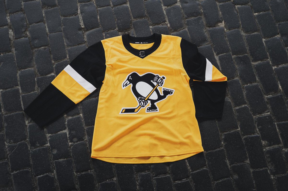
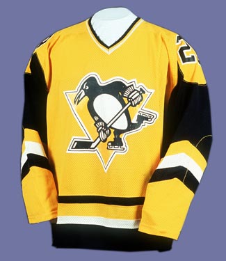
Exactly what I said elsewhere. Even before seeing your photo I thought the yellow should come down further towards the elbow like the older jerseys. There's way too much black on the sleeves. I also don't like the single layer/color "C" & "A". Small details are lacking, but they kind of added up.Here's the blank:
The yellow gold needs to come down off the shoulder a bit. It looks like a vest.
Oh I actually love that dimple effect on the shoulders. If it makes a difference, it's on all the jerseys in that same spot, including our home/away. I think they are just very prominent looking in that photo due to lighting.I agree, those changes would make it look better. The mesh up top is so **** hideous, though. I guess I was just hoping for a different style of throwback.Again, throw the actual logo on it and it immediately becomes better. Move the numbers to the sleeve and it's great. This just comes off as lazy.
Users browsing this forum: No registered users and 26 guests